Tuesday 2 October 2018

Still Life Notes

Still Life...

Notes for a workshop for the Kennet Valley Art Group:

With still life, you are in total control of your subject matter.  Your subject doesn’t move about while you’re trying to paint it.  Usually, you can control the lighting.  You can spend as long as you like choosing and arranging your subject matter until you find an interesting and satisfying composition.

You can make a statement with a still life – about certain visual qualities, about the transience of things, the relationships between things, the meaning of specific objects… whatever appeals to you.

Look at Morandi, Cezanne, Picasso, Chardin, Dutch masters.

Composing your subject

A few simple guidelines…

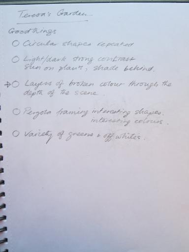
·       Choose objects that are related in some way.  Have a ‘theme’.

·       Consider the background right from the start.

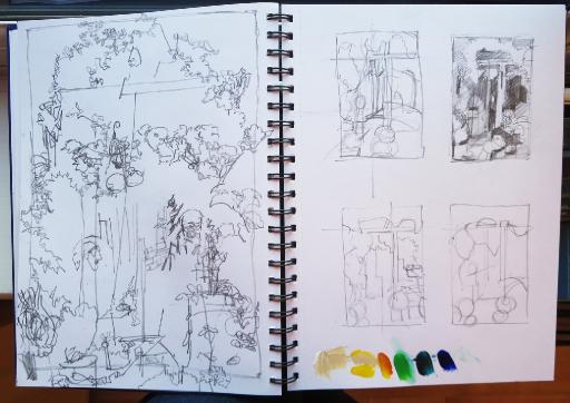
·       Make some very quick thumbnail sketches to work out your composition, in terms of
  shapes and major tonal areas.

·       Try to get a flow through the painting, to draw the viewer’s eye around the picture.

·       Avoid clashing edges, where things touch but don’t overlap.

·       Don’t leave vast amounts of space around your subject.

·       Aim for balance but not symmetry.


Negative space

Negative space is any area in your painting that is NOT a specific object.  It consists of the shapes around and between things.

Since watercolour is a transparent medium, you can’t paint light on top of dark, or a colour on top of its complement – the underlying wash will show through.

You can paint dark on light.  That’s fine where the object is darker than what surrounds it, but what if the object is lighter?  Well, then you paint the negative area behind or between your objects.

This is tremendously useful in watercolour, as it enables you to paint a broad, loose wash, and then a darker wash to ‘cut out’ the object.  Much better than painting each shape separately like painting by numbers.  It does take a bit of thought! 

EDGES – think about the type of edge you want; soft blend into another shape (wet on wet), or hard edge giving definition (wet on dry).  If in doubt, fade it out.


Back to the Palette Knife

Palette knife painting: photo, blind contour drawing, plans and under-painting, made in a friend's garden, mid September.  What a lovely day!

20180904_145949 Large.jpg .  IMG_3269.JPG

27Sep18 Lorna 6a Plans.jpg20180904_150038 Large.jpg .   .27Sep18 Lorna 6b Teresas Garden WIP.jpg

Teresa's Garden 


Colour/Tone/Intensity

 Notes on the use of Colour/Tone/Intensity

You have to consider tonal values. These are used to define form and depth and, in monochrome work, can indicate colour.

You have to consider colour. This divides into choices of hue and intensity.

You can use tone or colour or a combination of both, depending on the effect you want, but either colour  or  tone should dominate - i.e. don't have a lot of colour  and  a lot of tonal variation.

If the artwork is mainly tonal, the colour should be secondary. Make sure you organise good, big areas of similar tones. This will make your art look good from a distance and give it strength. Think Rembrandt, Picasso. Don't have little darks and lights dotted about. Choose your hues to suit the required tone...for example, you can't paint a low key painting with yellows which have a naturally high key.

If the artwork is mainly about colour, have most of your colours in the same tonal range. See  Ittens's colour/tone grid . Think Van Gogh, Bonnard.  

When using mainly colour, you won't be able to get much depth in your painting. You can still represent the direction of light by using colour intensity. Intense (pure saturated colours) will appear to glow with light. Dull, muddy colours will sink into shade, even if they are quite light tonally.

Each hue has a natural tone at which it is most intense. For example, yellow is most intense (pure, brilliant) in light tones. As you make yellow darker, it becomes duller. Blue is most intense in the mid range, less so in high tones (white added) or low tones (black added). Red is naturally dark. This is really clear in the Ittens grid.

To make all the areas of a painting sit comfortably together, you have to lay down neighbouring colours and tones that match. That way, they can all talk to each other, without one element shouting everything else down.  Try for harmony but with some contrast.