Friday, 16 November 2018

Mugging my artwork

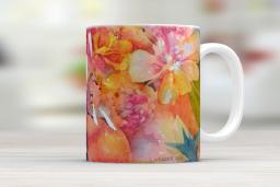
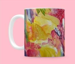
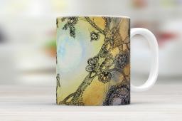
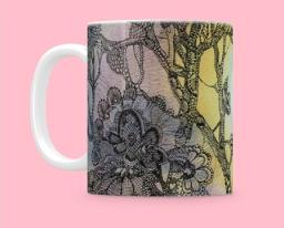
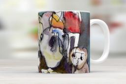
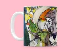
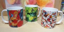
I spent a while perfecting (!) my book of artworks, and then I found the printing company Printerpix also print mugs, so I had a happy time trying out mug designs on their preview program.  What do you think?

screenshotdesign.printerpix.co.uk2018.11.16183846.jpg .   screenshotdesign.printerpix.co.uk2018.11.16184005.jpg

screenshotdesign.printerpix.co.uk2018.11.16184126.jpg .   screenshotdesign.printerpix.co.uk2018.11.16184147.jpg

screenshotdesign.printerpix.co.uk2018.11.16184348.jpg .   screenshotdesign.printerpix.co.uk2018.11.16184407.jpg

I did order some mugs which arrived this morning, and they look remarkably like the mock-ups I showed earlier, so I'm really pleased.  I still have some available so contact me if you'd like one - £10 plus p&p.


IMG_3373.JPG

Sunday, 11 November 2018

Entrophic Graphomania

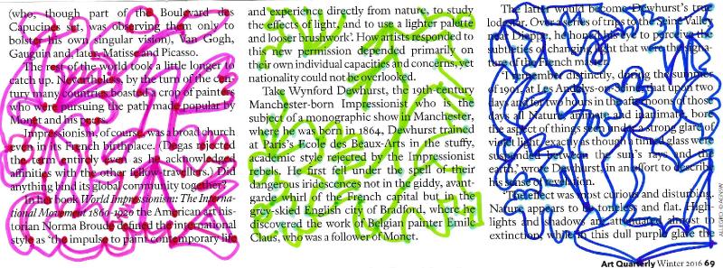
The idea is to take a plain white piece of paper and make a dot wherever there is some small fault or mark in the paper.  These days, paper is so pure it's hard to find any blemishes, so I tried another method, which is to use printed paper.  I selected the letter E in each block of text (I could have chosen a word or a punctuation mark, or vowels and so on).  Having made dots, the next step is to join them together in any way you like.  This is my first go at it...

Entropic Graphomania 1 2.jpg

It would be an option to make the dots on tracing paper and create a drawing without the actual underlying entropy, but I thought it would be more interesting to do the first one 'showing the workings' as it were.

Last night I went to a meeting of my Creative Exchange group.  I try to provide some sort of activity or game to spark off our creative discussions so I thought we'd do some "Entropic Graphomania".  
Take a block of text and mark some chosen attribute.  Then you link the marks together with some free-form lines in whatever way you like.  Can be coloured in too.  I made two, using tracing paper to make the marks from the text, so you don't see the actual text.

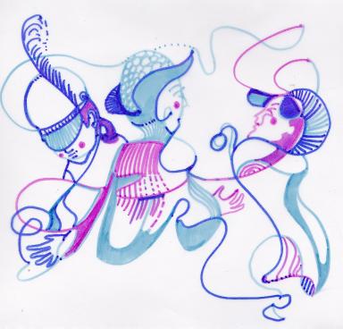
In the first one, I selected the words "was" (blue marks) and "is" (pink marks).  It all turned a bit 1920s Vogue!
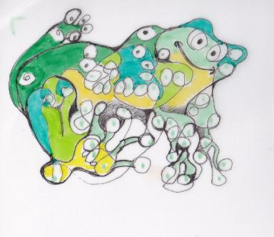
The second one was marked on the letter 'a'.  I circled and looped the marks and it looked like frogspawn, so when it was all joined up, I coloured it as a frog (a frog-like creature anyway).

9Nov18 Lorna1.jpg .   9Nov18Lorna2.jpg


Rock On!


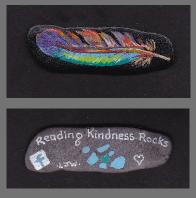
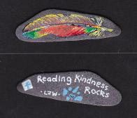
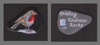
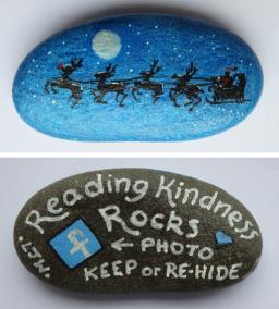
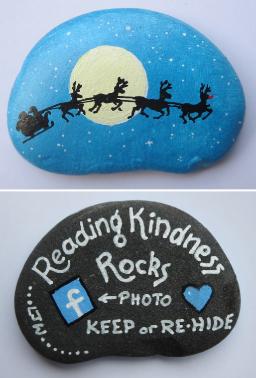
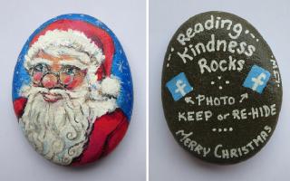
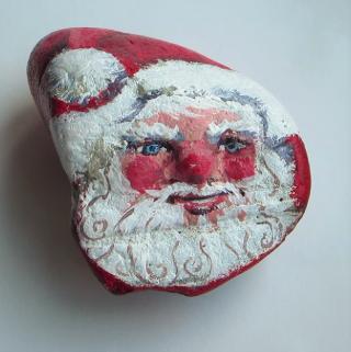
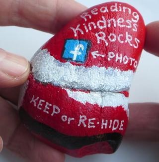
I've been rock painting for Reading Kindness Rocks.  These will most probably be auctioned for charity.

I bought a pack of 30 largish flat pebbles to paint.  I've done three of the flat ones and a couple of chunkier rocks that I got from the Reading Kindness Rocks group...

gallery image              gallery image

gallery image

Rock Sleigh 1 front back Medium.jpg .   Rock Sleigh 2 front back Medium.jpg ,    Rock Santa 1 front back (Medium).jpg

MVI_3405_Moment 2.jpg .   MVI_3405_Moment3.jpg .   


Friday, 2 November 2018

Inktober 2018

Inktober 2018

Oh wow, what a marathon!
31 drawings from Jake Parker's Inktober prompt words.
See the full set of 31 drawings in my Facebook Album here:

https://www.facebook.com/media/set/?vanity=LornaWebberVipond&set=a.1190709887734631


Tuesday, 2 October 2018

Still Life Notes

Still Life...

Notes for a workshop for the Kennet Valley Art Group:

With still life, you are in total control of your subject matter.  Your subject doesn’t move about while you’re trying to paint it.  Usually, you can control the lighting.  You can spend as long as you like choosing and arranging your subject matter until you find an interesting and satisfying composition.

You can make a statement with a still life – about certain visual qualities, about the transience of things, the relationships between things, the meaning of specific objects… whatever appeals to you.

Look at Morandi, Cezanne, Picasso, Chardin, Dutch masters.

Composing your subject

A few simple guidelines…

·       Choose objects that are related in some way.  Have a ‘theme’.

·       Consider the background right from the start.

·       Make some very quick thumbnail sketches to work out your composition, in terms of
  shapes and major tonal areas.

·       Try to get a flow through the painting, to draw the viewer’s eye around the picture.

·       Avoid clashing edges, where things touch but don’t overlap.

·       Don’t leave vast amounts of space around your subject.

·       Aim for balance but not symmetry.


Negative space

Negative space is any area in your painting that is NOT a specific object.  It consists of the shapes around and between things.

Since watercolour is a transparent medium, you can’t paint light on top of dark, or a colour on top of its complement – the underlying wash will show through.

You can paint dark on light.  That’s fine where the object is darker than what surrounds it, but what if the object is lighter?  Well, then you paint the negative area behind or between your objects.

This is tremendously useful in watercolour, as it enables you to paint a broad, loose wash, and then a darker wash to ‘cut out’ the object.  Much better than painting each shape separately like painting by numbers.  It does take a bit of thought! 

EDGES – think about the type of edge you want; soft blend into another shape (wet on wet), or hard edge giving definition (wet on dry).  If in doubt, fade it out.